Thirst Comes First

As a part of our RWI Labs group, RWI is exploring High Impact Low Frequency (HILF) modelling by creating a cyber outage in Synthetic Vancouver, called a Black Sky event. We want to look deeper into the expected and unexpected outcomes. We are calculating how having access to a detailed, hyper-localized population helps uncover more information that extends current disaster response methods. With the increasing number of HILF events, this focus on preparedness, mitigation and recovery from a human-centric perspective will drive more informed, empathetic, interconnected resilience planning in all sectors.
What are Population Density maps?
Population Density maps are currently used to plan and respond during disaster scenarios. They indicate areas with more and fewer people. Planners and responders use this density information for a variety of purposes. The density map highlights where more people are located, driving urgency to revive densely populated areas first. While in some situations, a Population Density map is sufficient (maps of municipal waste generation for waste collection planning purposes, for example), most emergencies warrant a more effective, even futuristic approach.
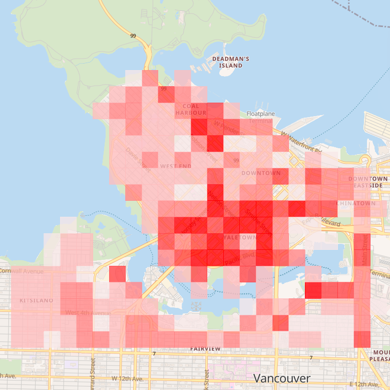
Figure 1: Population density map - calorie consumption
Why Thirst maps over Population Density maps?
Thirst Maps locate the most vulnerable in our population in terms of hydration needs, highlighting those who need water right now. These maps indicate who needs water first, as well as the amount of water they need. Thirst Maps are some of the first implementations of the concept, “There is no one-size-fits-all approach to resilience,” and can be geared towards other uses such as dehydration, hunger, waste, etc.

Figure 2: Population density map - solid waste generation
In contrast, Population Density maps indicate which zones or areas of a city need more water (a cumulative sum), which helps emergency planners to deliver water or restore drinking water supply where more of it is needed. However, the drawback to this approach is that the visibility of individuals with a higher urgency of the need for water is lost. This may prove vital to saving the lives of our vulnerable citizens.
Typical Population Density Maps often show the same results even when mapping different aspects like calorie consumption and solid waste generation as seen in figures 1 and 2.


RWI’s Thirst Maps can geospatially pinpoint the vulnerable populations and the cause of vulnerability intersectionality (2) arising from an individual's demographic factors such as age, gender, pre-existing health conditions, mobility margin, economic margin, living conditions, household size, etc. Preparations and mitigations in advance may connect agencies or engage community members to plan responses that target and reach vulnerable members as a priority.
Let’s consider a case study from RWI Labs: imagine an older person who has a mobility margin due to a physical disability. They live alone in a remote part of the city, are technologically impaired, and suffer from diabetes. If the water system is also affected during a power outage, they will quickly be faced with thirst and be more vulnerable to dehydration. Such a person will likely not be able to leave their home with ease to look for water. Communication system issues may further complicate their ability to reach help. These people may need to work with agencies in advance to ensure that they have means and plans in place in the community for rapid support.

Figure 3: RWI’s Thirst Map (grid) overlaid with the Population Density map (cluster) shows how those outside the densely populated zones and critically thirsty can be missed - showcasing the main difference between the two and why RWI’s Thirst Maps are better.
As the legend in the figure shows, orange/red areas show higher thirst levels while green areas show “safe” or lower levels of thirst. In the cluster, the bigger circles show more densely populated areas. The people in the smaller clusters that coincide with the orange/red grid zones are most likely to be overlooked by traditional Population Density maps - and the results of this oversight can be fatal. On the other hand, Thirst Maps focus on the areas with higher levels of thirst regardless of how many people exist in that respective area at any point in time. This paints a more representative picture of what the situation might look like in a water crisis, allowing emergency responders to plan most efficiently and effectively.
Results
RWI’s SSE utilized in the RWI Labs project produced interesting and insightful results. As the outage continued, the thirst levels changed, increasing with time and at different individual rates. We observed that those with diabetes were particularly vulnerable to thirst, as were children. Children needed water before adults with diabetes, even though the amount of water needed by children was less than that needed by adults to prevent fatal thirst and dehydration levels. Intersectionalities make a big difference in these cases. Understanding who in at-risk groups may have what degree of access to caregivers who are more mobile and able to obtain relief services and who does not and to what degree all become critical for planners. Complex relationships like these were identified and organized to construct data stories, enabling decision-makers with more preparation and mitigation information.

In the first iteration of RWI Labs, pre-existing conditions such as diabetes, heart disease, cancer, as well as those suffering from alcoholism or addictions were put under the microscope to uncover the profound impacts a long-term outage would have on these segments of the population. We looked at marginalities (1) in more detail by introducing the marginalities of mobility, income, and security. This was included to recognize and represent the unique challenges faced by our diverse citizens in the world today. We also looked at people living alone and those living with family or friends to see how social support or lack thereof, could impact the outcome. Similarly, we looked at those who live in high-rises versus low-rises or single-family dwellings to find the difference. Lastly, we looked at intersectionalities. Intersectionalities are an important segment of our synthetic population because when a person has multiple limitations, margins, or health conditions they are increasingly more vulnerable in comparison to others.
The reason why we chose these segments (people with single or multiple margins, high and low-rise dwellers, people who live alone, people with pre-existing health conditions and addictions, elderly people, etc.) is to further explore who these individuals are, where they live, what their other demographic and psychographic characteristics, and to highlight their stories. In traditional data analysis, researchers utilize aggregated data for purposes like constructing population density maps. However, traditional data analysis often makes these segments invisible, which hinders effective and efficient disaster response.
The questions that RWI Labs has answered include:
Are there changes in individual and aggregated thirst levels over time?
Who needs water more than others? How much and where?
Who reaches fatality first, when and where are they?
Who can go out to find water and who needs water delivered to them?
Why is someone able or unable to seek water (mobility marginalized, elderly, young, having pre-existing conditions, critically thirsty, etc.)?
What kind of behavior results from extreme thirst? Who exhibits this behavior?
Who is more prepared, who is less prepared? Where are they on the map?
The questions RWI Labs aims to answer as we continue our study include:
How can water-resilience be improved on a household and community level?
Which technologies will propel resilience in a cyber outage (microgrids, V2X, wastewater-to-energy systems, air-to-water technologies, mobile batteries, etc.)?
What are the impacts of extreme weather conditions and COVID-19?
Are the utilities interdependent on the grid network, and how much?
What are the best recovery and repair plans for the grid and related utilities?
What are the impacts on the Quality of Life and the economy?
What are the impacts on the environment?
Are there any answers YOU would like us to find using our Synthetic Environment? Please feel free to reach out on Twitter or LinkedIn, both linked below.
RUNWITHIT is actively working to contribute to the United Nations Sustainable Development Goals (SDG’s). This project has contributed to the following SDG’s: